Sunday, 30 October 2011

Experimenting with light - photography

I visited the castle with my wife on two occasions to take photographs:
  • On the first visit, it was an overcast wet day with low levels of very diffuse light. I have included a couple of photographs from the first visit even though they are slightly soft. (There was some slight movement even on a tripod when I tripped the shutter by hand. There was a problem with the remote shutter release). Under these conditions, the shadows were subdued and the differences in light direction were not very prominent.
  • On the second visit, the day was a lot brighter resulting in stronger shadows. The photographs were all sharp as I had overcome the problem with the remote shutter release.
1. Front lighting - second visit
Nikon 18-200 mm at 62mm: Iso 160 f4.8 for 1/20th seconds
In this photo, the light is coming from behind and slightly above the camera. There is slight modelling from shadow areas on each side of the nose and the sides of her face.
There is little shadow around her eyes, and the shadows cast by her glasses are hardly noticeable. There are catch lights in the centre of her eyes and highlights on her nose and lips.
The background wall is illuminated by the same level of light and thus appears relatively bright.
The collar and front of her coat are evenly lit with little light shadow.
2. Front lighting - first visit
Nikon 18-200mm at 70mm: Iso 160 f5 for 0.8 seconds
The light is coming from a similar direction but is more diffuse. The low light levels means that the shadow areas and highlights are more subdued. The lack of contrast means the portrait seems less vibrant, but the darker background has a restful effect.
3. Side lighting - second visit
Nikon 18-200mm at 62mm: Iso 160 f5.6 for 1/10th seconds
The light direction is from the side but slightly forward of the subject. The left hand side of her face is in shadow except for bright patches in the corner of her mouth and under her eye. I selected this photograph as I liked having these bright patches which were missing in the others.
There is a reasonably strong contrast between the light and dark sides of her face even though I felt the lighting was quite diffuse. The background is now significantly darker than the bright side of her face. As a result, her face stands out much better in the frame than the front lit photographs above.
Her glasses cast a dark shadow by the side of her right eye. I used Lightroom to lighten these, but I possibly should have been bolder. This shadow still seems darker than the shaded side of her face, and I think it would have been better if these were similar in tone.
There are also strong shadows on the collar of her coat which add to the tonal variety of the photograph as a whole.
4. Side lighting - first visit
Nikon 18-200mm at 70mm: Iso 160 f5 for 1.6 seconds
The contrast between bright and shadowed side of the face is significantly lower as the weather outside was overcast.
Whilst the light side of her face is distinctly brighter than the background tone, the difference is much smaller so the portrait is less punchy than the one above.
Unlike the previous image, her eyes are both slightly shadowed and there are no brighter areas on the left hand side of her face. However, the shadows cast by her glasses are similar in tone to the shadows around her eyes and as a result, they are less significant.
I think it was fortunate that she wore the dark polo neck on this day, as this adds to the overall contrast of the photograph. If this had been medium-toned, the photographs would appear very flat in these dull lighting conditions.
5. Backlighting
Nikon 18-200mm at 60mm: Iso 160 f5.6 for 1/6th seconds
With the light coming from behind, there are no shadows on her face. There is however enough tonal variety to show her facial features. Her eyes stand out strongly as there are no shadows or reflections around her eyes and glasses to obscure them.
The rim lighting in her hair and around the collar of her coat act as a contrast to the background which is similar in tone to her face. This also delineates and frames her head and face.
6. Light from both sides
Nikon 18-200mm at 105mm: Iso 160 f5.6 for 1/4 seconds
For this photograph, Val sat in between two windows. A south facing window on the left hand side and slightly to the front was the strongest, lighting up the left hand side of her face. On the right hand side is another window that faces north. This second window is slightly behind her, so that it lights up only the side of her face, cheek and nose. The forward facing area on the right hand side of her face is still in shadow.
Comparing this with the single source of side lighting (photograph 3 above), the addition of a second light source has some beneficial effects, in my view:-
  • The shadows cast by her glasses around her eyes are less strong;
  • Her hair is brighter and more evenly lit.
  • There is an impression that her face is rounder in shape. In the side lit photo 4 above, the vertical areas of light and shade make her face seem longer than it should be.
Techniques
I did not use a reflector to lighten shadow areas in taking these photographs. This was not appropriate in this location as I had at least four light sources around the room. The challenge was to place the seat close to walls and corners of the room in a way that limited the secondary sources of light. In fact, I used a dark umbrella to block stray light in the side lit photo 3.
Having watched a couple of AdobeTV videos on processing portrait photographs, I used Lightroom 3 to adjust the photographs above to brighten the irises, smoothen the skin and adjust some skin blemishes.
Conclusions
The project has been valuable for me, as I have had the opportunity to look in some detail at how light has enhanced or detracted from the portraits I have taken. Some of the factors I identified above were:-
  • It is important that the relative brightness of the face, hair, clothes and background is appropriate.
  • At the same time, there must be sufficient variety in the tones that the photograph is not dull (especially for black and white).
  • The areas of light and shade around the eyes are also important. This is especially tricky for someone wearing glasses due to the shadows and reflections caused by the spectacle frame and lenses.
  • It is necessary to consider how the patterns of light and shade influence the perception of shape by the viewer.
It has also been useful experience in the practicalities of controlling natural light to achieve a desired effect.
Whilst I liked each of the four photos that I took on the second visit to Guildford Castle, if I had to choose just one of these, it would be photograph 6. The reasons for this are that I think that the background was too light in photo 1. In photo 5, her hair is quite dark (except for the rim of light) and seems to lack form and body. I noted some reasons for preferring photo 6 over photo 3 in my comments above. Even though I prefer her gaze in photo 3, visually, I think the qualities of photo 6 are better.

Experimenting with light - planning

Guildford Castle was the venue I chose to use for this project. On the upper floor there is a large square room which is virtually empty with high windows and relatively plain plastered walls. This provided a location with diffuse daylight, neutral backgrounds and space to move around.
Guildford Castle

On the visit to reconnoiter the castle, I noted that there were two windows on the south wall, one each on the north and east walls, and the entrance door on the west wall. I planned a couple positions where the daylight on my wife's face would be in front, sideways and backlit with a plain plastered wall as background. I also noted a position where light would fall on both sides of her head, replicating the lighting conditions of the earlier photograph of her that I liked. I also planned to go equipped with a reflector to add light and a dark umbrella to provide shade.
I also decided to present the photos in black and white as I felt the light and shadows would be more prominent in a monochrome photograph.

Friday, 28 October 2011

Visa Festival of photojournalism - Fernando Moleres

I bought the September edition of Photo magazine whilst in France last week. The main articles covered photography presented at the Visa 2011 Festival of Photojournalism held at Perpignan. Whilst the subjects taken by photojournalists are often distressing, I felt that there were some aspects which parallel with travel photography: -
  • Understanding a foreign location and developing a narrative/theme for a series of photos
  • Planning how photos can visually communicate the features of the situation.
  • Compiling and presenting a sequence of photos.
I have chosen to write about a series of photographs by Fernando Moleres "No children in prison" for various reasons:
- plenty of material: the article included six pages of photographs plus an interview with the photographer;
- people are the principal subject, with a mixture of portraits and people in a specific environment;
- I felt the compositions were effective in communicating points in narrative;
- these photos are displayed on his website, which I could link my comments to.
Fernando Moleres is a photographer based in Barcelona. He took up photography in 1991 after previously working in hospitals in third world countries. This project was inspired an exhibition of photographs by Lizzie Sadin at an earlier Perpignan festival about young people in prison around the world. He obtained funding from a municipal council in north west Spain intended to encourage tolerance by photography of social realities around the world. The photographs were taken in a particular prison in Freetown, Sierra Leone over a period of forty days. I have just selected a few that impressed me.
Behind bars (my description as the photographs are not titled)
This image shows the faces of two young prisoners standing behind the bars cell with a background filled with the faces of the other prisoners. The faces are looking directly at the camera engaging the viewer strongly.
This image shows part of a cell where 65 prisoners are sleeping on the floor of a small cell. They lie in a mixture of heads, feet, legs and arms. Just one person is alert and looking at the lens.
A group of prisoners are standing out in the rain, with arms outstretched, shouting out in exhilaration, it seems. The prison has limited water supply so rain is a rare opportunity to wash. The elation displayed by the mens postures in this photograph contrasts with the (understandably) solemn expressions in most of the other photographs.
This photograph of a man asleep on his desk in a room stacked with piles of papers was placed as the final photograph in the sequence shown in Photo magazine. The caption says that this is the man responsible for release of the prisoners, but he has little motivation to properly process their release. The hopelessness of the young prisoners situation is aptly conveyed by this scene of utter disorganization.
Conclusions
I was impressed by the visual qualities of these photographs, only a few of which I have mentioned above as illustration.
The photographs show a surprisingly frank view of the situation for someone visiting for a relatively short time.
They convey pictorially the key points of the situation in the prison. It shows the hardships of the prisoner's lives, but without using the camera effects to over-dramatize their circumstances.
Whilst the photographer has a deliberate "agenda" to show the plight of the prisoners, I feel the sequence of photographs are relatively neutral, showing glimpses of daily life, good and bad, as well as the indifference of the guards and administrators.
I would assume that the presence of the photographer has excluded the worst realities of life in this prison. Nevertheless, it is better to have some insight into the conditions in such a place rather than none at all.
It would be interesting to understand the ethical standards used by the photographer in relation to this photojournalism assignment. I did not find information on this in the article or the website, but I assume the photos represent a "controlled" situation "undisturbed setting, but photographer influences the scene e.g. "hold that pose".

Friday, 21 October 2011

Eyewitness exhibition of Hungarian Photographers - Royal Academy

This exhibition showed the work of some major 20th century photographers, all of whom were Hungarians, including Kertesz, Capa, Moholy-Nagy, Brassai. I knew the names of these individuals from the photography books and articles that I read for TAOP course. Kertesz, however, was the only one where I had seen more than a few images. I had enjoyed a review of an exhibition of Andre Kertesz's photography which was held in Paris in October 2010. I was particularly struck by his originality and adaptability.
I was looking hoping to see some of the photos that I had seen in the article. I also noted some ideas for portraits and people photography.
This photograph by Kata Kalman is a tightly cropped photograph of this workers face. He is young and has a determined expression that seems to challenge the viewer. He appears self confident but also I get a feeling of endurance in what I assume was a harsh environment. Factory workers in both Europe and US were presumably adversely affected by the economic recession of those years.
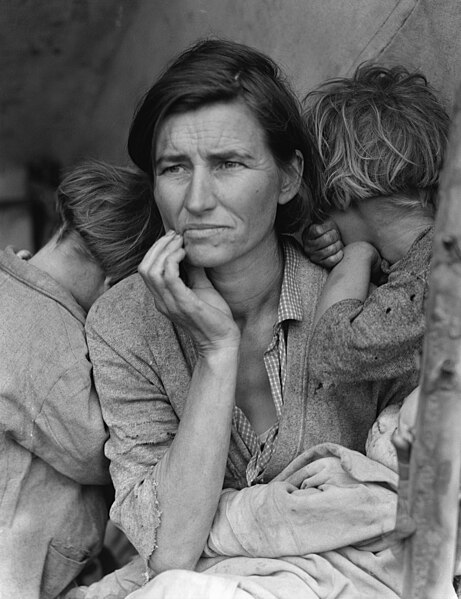
The photograph resembles the atmosphere of the famous photograph by Dorothea Lange, Migrant Mother, Nippomo, California.
In this photograph by Kati Horna, the features of a womans face are superimposed on a wall overlooking steps that presumably lead up to the cathedral. There is a window in the position of one of her eyes, and her eye is seen looking out over the steps. To me the woman's face is reminiscent of a Madonna expressing pity for the people's sufferings. I read subsequently, that Kati Horna was a woman photographer, close to Frank Capa who went with him to Spain during the Spanish Civil War. Her photography focussed primarily on the suffering of the ordinary people rather than the events on the front lines and battles. This photograph/photomontage seems to symbolize the desperation of the people in the streets during the civil war.
The impact of the image was not immediate, until I realized that the eye visible through the window formed part of a face. On reflection, the image is quite haunting, even though the facial features are more symbolic than portraying a specific individual.
There were two different portraits of Picasso in the exhibition, this full length portrait by Brassai, and a head and torso by Rogi Andre (real name: Rotzi Klein).
In Brassai's photo, Picasso is seated besides a huge stove or boiler that stretches up to the ceiling. The boiler is a very striking piece of industrial equipment. Furthermore, it has been lit to cast an oversize dark shadow on the wall, and Picasso is seated directly in front of the shadow. This gives the impression of a visual connection between Picasso and the boiler. Picasso is actually looking out of the picture away from the camera, as if he would rather be somewhere else. The lighting of the scene creates a strong visual composition, similar in character to some of Brassai's night photography. The exhibition notes suggested that the boiler symbolizes Picasso's creative fire. For me however, the lack of materials dropped on the floor, and the tweed suit and tie worn by Picasso do not strongly portray the vibrancy and chaos of testing ideas. Picasso looks as if he is about to leave for the opening of an exhibition of his work rather than work on his latest project.
Conclusions
These photos illustrate the variety of feelings conveyed by portraits: social reportage (Factory worker), symbolic/iconic representation (Stairway to the cathedral), visual pleasure of composition (In Picasso's studio).

Wednesday, 19 October 2011

Thinking about location - photography

I returned to GLive the day after my scouting visit at about the same time of day. My wife had agreed to be my subject again. As mentioned in my previous blog, the modern architecture of this building suggested to me an "on location" fashion style of portrait, such as this page from Madame Figaro by Sonia Sieff.
I had gathered a few ideas in my mind on what poses might work for the locations, and I had chosen a top three of the six viewpoints. Unfortunately, the overcast weather of early morning had broken up, and the sky was a cloudless bright blue. This was not at all suitable for any of the locations that I had found because they were in full sunlight creating hard shadows and making it uncomfortable for her to look at the camera. It also made exposure difficult.
I went ahead and took some photographs anyway at the top three places: the settees in the cafe area, the balcony at the front of the building, and the acute angled space on the east facing wall.
After reviewing the results, I selected this photograph of Val on the balcony at the front of the building.
Val at GLive
Nikon 18-200mm at 36mm:Iso 160 f4.5 for 1/1250th seconds
I chose this photograph because the pose is more active than the other photos that I had taken. Furthermore, the white pole is reflecting light into the shadow side of Val's face providing a better balance of lighting than the photographs where she is standing away from the pole. The horizontal and vertical lines contribute to the photo giving a sense of the shape and style of the place in which she is standing.
As expected, this photograph needed some work in Lightroom, in particular to adjust the colour cast and to add fill lighting, as I had slightly underexposed the photo to avoid blowing out the bright white of the pole.
Conclusions
This was good practice for taking people photographs:-
- anticipating some poses that might work, rather than trying to make suggestions off the cuff. I found that I needed to come up with ideas from my own imagination and memory. I spent quite a bit of time on the evening before looking at portrait/people photographs on various websites: OCA student site, OCA Flickr site, Flickr photos tagged Portrait, Getty images on Flickr searching for Portraits. I was surprised that portrait photos are quite sparse, except for Getty Images. Even so, I did not find the sort of thing I was looking for there. I eventually located the Sonia Sieff fashion photos this afternoon after checking out the Wikipedia site of her father, Jeanloup Sieff.
- having to adopt to the different lighting conditions to those I expected.

Thinking about location - planning

I chose to visit the surroundings and interior of the new concert hall in Guildford called G-Live to look for places suitable for portrait photography. The building is a modern geometric structure with large white-walled open spaces, lit by natural light from a glass frontage and skylights. It stands in its own grounds and there is only one side where it is close to neighboring buildings. The building is open throughout the day, it is relatively quiet in the daytime.
I visited the building late morning on a bright but overcast day to scout out the possibilities.
There were several reasons for choosing G-Live to look for photography locations:
- For this project, I considered it was important to find settings which had notable visual qualities that would contribute something to the image. I believed that this building would be suitable: I could imagine a fashion photography shoot taking place there.
- The building has only just opened a few weeks ago. Hence, it was a new place to explore.
- It is close to where I live and hence easy to visit several times.
Major areas of the building exterior are glass panels around the entrances, and relatively featureless plain white walls around the rest of the building. Neither of these seemed to provide visually interesting features for a photo.
Three places seemed to have some potential:-
Bench on east side of building
The distant brick wall is quite shady and would provide a plain dark area against which the subject should stand out (the electricity junction boxes on the wall would need to be concealed or cloned out). The bench provides somewhere for the subject to sit, and the bench, stone and ornamental grasses would provide unobtrusive texture and colour.
Acute angled space on east facing wall
One of the decorative features on the outside of the building are wall areas clad with brown textured tiles. One of these by the north entrance of the building makes an acute angled space on an otherwise creamy white wall which faces east. I envisaged that a photograph could be taken from the position shown, where the subject would be in front of the white wall with the shaded brown tiles behind. The dark lines between the light coloured wall tiles angled by perspective would represent an extra visual element to the composition.
(This angled shape is reminiscent of the studio set up used by Irving Penn in a number of portraits taken in the 1940's.)
Light panel sculpture
According to the plaque, this sculpture will play a sequence of coloured lights when triggered by receipt of a text message from anyone. I envisaged that the shape and plain surface could be interesting as part of a portrait photograph. From most positions, the background was bright sky and too busy, but from this position and focal length, the brick facade of the building across the road provides a relatively plain background. The sculpture faces west so the light was largely from behind at the time of my reconnoiter visit. I would expect to use this location later in the day when the light is from the south or west.
I identified three potential places to photograph a person in the building interior:
Settees in cafe area
When I first looked at the cafe, I did not think that it would provide a suitable place to photograph someone as the glass walls showed bright areas outside and bright reflections of the interior. However, this problem did not arise from this viewpoint on the floor above. The geometric shapes and neutral colours of the settees also should add visual interest to a photograph.
Balcony at the front of the building
There is a glass fronted balcony on the first floor of the building facing east. I imagined that the diminishing perspective of the dark window frames on one side and and the white pillars on the other could provide an interesting frame in which to place a subject. This area is well lit by daylight from the glass wall on the left hand side so I expected to take a picture from the camera position used here with the light from the side and above. I noted, however, the tinted windows create a colour cast, which would need to be corrected.
Balcony above the north entrance
I rejected many places in the interior as unsuitable for a couple of reasons:-
- Away from the glass walls, a significant part of the light came from electric lighting. My experience has been that it is difficult to achieve reasonable skin tones in such mixed lighting conditions.
- It was not easy to find places where there were structural shapes and shadows that created a sense of depth and place.
I found this viewpoint however looking up at a narrow verandah on the floor above. I thought that the shadow areas underneath the verandah, and the passageway on the right hand side provided a reasonable feeling of space. The verandah is lit by daylight from a glass wall just in front of it, as well as light from a skylight from above. The colour of glass again creates a greenish colour cast that would need to be corrected.
Conclusions
The criteria that I used in selecting these locations as suitable for taking portrait photographs were:-
- visual interest: I was looking for a viewpoint with characteristics that would convey to a viewer the shape, depth and nature etc of the scene. I did not want a plain flat background of the kind I used in project 1.
- plain background: The scene should be complementary in colour and tone to the person being photographed. It should not over-power the image of the person.
- lighting conditions: I wanted a place that was well lit. The lighting should not be a mix of natural daylight and artificial light.

Saturday, 15 October 2011

Portrait, scale and setting - execution

My approach to taking the photographs was slightly different to that suggested in the notes as I intended to take photographs of my wife in three different positions. Of the positions that I tried described above, I decided to use three: seated in a chair well inside the doorway, standing in the doorway, and seated sideways on the floor in the doorway.
Also, I found it easier to start with a full length photo at first and then to move closer with the subsequent photos, rather than start with the face cropped in close.
In the space of half an hour, I took a sequence of almost 70 photographs including each of the four framing stages (face, head and shoulders, head and torso and full length) for each of the positions. Subsequently reviewing the photos, I chose the two best "face" photos, the two best "head and shoulders" and so on, for each framing position. Finally, I picked the best of each pair,and made an A4 size print of each one. My comments on the final photographs follow below.
Face, cropped in close
Nikon 18-200 mm at 170mm: Iso 160 f5.6 for 1/5th second
This photo was taken from the first sequence with my wife sitting on a chair inside the room away from direct light. I preferred this over a similar pictures taken in the doorway as the light is softer with only the slightest shadows.
Observations
Her eyes are, naturally, the points that most strongly draw the viewers attention. They are framed by spectacle frames of a similar colour and sit roughly two-thirds of the way up the vertical frame. The spectacle frames enhance the strong attraction of her eyes.
Unlike photos I have taken of her previously, her expression is not smiling, but she has a neutral, slightly questioning expression. For me, the departure from the convention of a smiling face has resulted in an image with a stronger visual impact.
I find that my attention drifts from time to time away from her eyes to her earrings (which have quite strong catch-lights), her hair and other parts of her face, but it returns to her eyes before long.
The original photograph was horizontal format, with slightly more space beneath her chin and above her eye line. I deliberately allowed some extra space so that I could fine tune the cropping in the computer.
The shaded daylight is coming from behind the lens. The sides of her face are shadowed leaving a narrower bright area in the centre of her face. Unlike the photograph taken in the doorway, the spectacle frames cast virtually no shadow on her face, which results in a "cleaner" area around her eyes. In addition, there are no significant shadows on either side of her mouth below her cheeks in this lighting, nor around her eyes.
Head and shoulders
Nikon 18-200mm at 70mm: Iso 160 f5 for 1/40th seconds
This is one of the photographs where my wife was sitting sideways in the patio doorway. I chose this photograph over another one from the first sequence where she was sitting inside the room because I wanted reasonable variety in the four chosen photographs. The other one was too similar in character to the first photo above.
Observations
In this photograph, her eyes are less demanding for the viewers attention. Her eyes are smaller in the frame, they are in some shadow and the spectacle frames are less prominent. The bright areas of her hair and the lower half of her face are able to compete for attention.
We can also see a part of the clothes she is wearing. These are greys and bluey greys which I feel complement her natural skin colour, drawing attention to her face, rather than competing for attention.
The matching light grey of her hair, her earrings and her scarf creates an implied frame for her face and lightens the average tone against the dark background.
The framing is as shot except for a slight adjustment to straighten up the doorframe on the left hand side of the frame. I also reduced the brightness of the white door frame so that this was less bright than the highlights on her hair and earrings.
As she is sitting in a relatively light position, I could reduce the shutter speed to 1/40th of a second compared to 1/5th for the first photograph above.
Head and torso
Nikon 18-200mm at 36mm: ISO 160 f4.5 for 1/40th seconds
I chose this position as one that is less formal than the sitting or standing poses. I asked my wife to hold a glass of water so that her hands looked natural, but they were partly concealed.
Observations
This photograph was taken within two minutes of the previous photograph with my wife sitting in the same position. The lighting on her head is unchanged, with her eyes slightly shadowed, with bright areas on her hair and face.
A viewers attention is also attracted by her hands, which are a similar brightness to her face and not much smaller in the frame. Her face is positioned in the upper left quadrant of the frame, with her hands in the lower right quadrant. Whilst there is a reasonably large dark area in the upper right portion of the frame, I feel that the position of her face and hands create a reasonably visual balance.
As with the previous photograph, the framing is virtually as shot except for slight adjustment to straighten the door frame on the left hand side. I have again lowered the brightness of this frame which otherwise was too prominent visually.
Full length
Nikon 18-200mm at 52mm: Iso 160 f4.8 at 1/20th seconds
The full length portrait was the most difficult to pose as I wanted the head, hands and feet in suitable positions. I did not select the full length photos of Val sitting on a chair or sitting on the step of the patio doors as these were less successful compositionally. Her legs appeared too prominent relative to her torso. I felt that the standing position is better as her head and torso are stronger elements in the frame than her hands and legs.
Observations
She is leaning against the door frame in a reasonably relaxed posture. Her face remains the main point of attention even though it is relatively small in the frame. Only one hand is visible, but this is simply hanging by her side and does not especially draw the eye. Her feet and legs are similar in tone and colour to her cardigan, and they are relatively unobtrusive. (In fact, I have darkened her shoes as they had bright highlights which were rather distracting. )
In this setting, the rest of the frame is largely blank. In the original photo, I included part of the glass patio door on the right hand side of the frame so that she was in a more central position. In reviewing the photo subsequently, I decided to crop out the area of patio door as this added nothing to the photograph. I quite like this lop-sided composition. I did not like the tall narrow frame when I tried cropping some of the dark area on the left hand side of the frame.
Conclusions
  • The planning I did beforehand paid dividends. From a relatively short session, I ended up with a collection of four reasonable photos. Without the planning, I would surely have needed several photo sessions as I would not have anticipated some of the issues beforehand.
  • The exercise was a valuable lesson in the components that need to be considered even for a "conventional" style of portrait. The responsibility for directing the subject is a departure from the type of people photography that I have done in the past.
  • I printed out the final four photographs on A4 gloss paper and my comments are based on those prints. My tutor for this course has indicated that he prefers assignments to be submitted in printed form, rather than sent as digital images, and I felt it would be better to use this methodology from the beginning. I am pleased with the printed portraits, which were produced on a new printer as the previous one stopped working. I am using a general purpose home printer using premium glossy paper. I nevertheless feel that I could produce better quality prints if I improve my expertise in this area, and I should probably spend some time looking at this.