Showing posts with label Exhibitions. Show all posts

Friday, 12 July 2013

Genesis - Sebastiao Salgado photo exhibition at Natural History Museum, London

I chose to visit this exhibition on a trip to London a few weeks ago, as I was interested to see his view of some wilderness areas of the world and some of the indigenous peoples who survive. To my mind, this is the adventurous frontier of travel photography, following in the footsteps of National Geographic photographers over many decades. According to Lelia Wanick Salgado, the curator of the exhibition (and the photographer's wife) the aim was to photograph people and places that "so far have escaped the long reach of today's world".
The photographs are extremely eye-catching monochrome images. My notes on the style of the photographs included:-

  • Extreme contrast - dark greys and whites. 
  • Limited midtones - gives a "wet look" to foliage. 
  • The composition and lighting gives an iconic quality to the places and people. 
  • It does not however look like the real world.  

Laura Cumming writing in The Observer on 14th April 2013 wrote : Salgado's habitual monochrome runs all the way from coal black to silver and burning white, with a thousand tones of grey in between. The lighting is characteristically spectacular, with plenty of backlighting and operatic contrasts.
I think that the Genesis photographs are somewhat similar in style to those of Larry Louie, a winner of the Travel Photographer of the Year in 2010. In an earlier blog on some of Larry's Indonesian photographs, I commented that:-
The composition and enormous tonal range make the images strongly eye-catching and he clearly merited the Photographer of the Year award. I would differ however with the observation made on his website that his photography is "Realism at its best". For me, on the contrary, these photographs portray an visually exaggerated view of these scenes and places. The images seem to be touched up that they represent an imaginary ideal of the world. This is somewhat similar to the comment that images of women in magazines do not portray what women are actually like. These are very memorable images, but they convey little sense of the actual place.
I had exactly similar feelings about the Genesis photographs. In fact, I think that hyperrealism may be a suitable term to describe this style. The saturated colours may be replaced by saturated blacks and saturated whites, but the visual effect is quite similar. 
For a couple of the locations in Patagonia, I had taken pictures of the same locations. I have included two  examples:
Perito Moreno Glacier


One would not guess by Salgado's 2007 picture from a higher location that this is "one of the major tourist attractions in southern Patagonia. It is less than two hours by bus from El Calafate (airport) and many tour companies run daily visits. A large visitor centre at the site features a walking circuit which allows visitors to view the southern flank and east facing edge of the glacier" according to Wikipedia. I think that Salgado's photograph was taken before the walkways were constructed to prevent erosion of the soil due to the large number of tourists.
Cerro Torre


Salgado's 2007 picture of this scene is taken in clear weather from further back.  This is a stunning spot, which is not yet visited by coach loads of tourists. It is however "the stuff of climbers dreams" according to the Adventure Journal. They estimate that no more than a thousand people have ever stepped foot on the top of Cerro Torre, one of the hardest climbs in the world. Many more will have trecked in the surrounding national park. This is no longer, therefore, the absolute wilderness. Ironically, some of the visitors may have been prompted to travel to such locations as a result of seeing the dramatically lit iconic images that Salgado has produced.

Hyperrealism exhibition at Museo Thyssen - Bornemisza, Madrid

In April, we spent a couple of days in Madrid. This was my first visit and one priority was to see the artworks in the Prado Gallery. We also found time to visit the Thyssen - Bornemisza Museum and I chose to look at their Hyperrealism exhibition which surveys the work of the Photorealism and Hyperrealism movement over the past 40 years.
The 66 works were arranged by theme: Still life, On the road (vehicles etc), Cityscapes and finally, People and portraits. Whilst only one work was a photograph, there were numerous similarities with photography.
The earlier works, produced in the time of film photography were referred to as "photorealistic", but with the advent of digital photography, the terminology "hyperreaslistic" is considered to be more appropriate.
The still lifes were uniformly large in size, width and height of 2 metres or more. This large scale allows the viewer to consider every detail of the subjects portrayed. This imitates the impact of blowing up photographic images to this size or larger. From a photographers viewpoint, the huge size reveals the artifacts of photography, for example, shallow depth of field, blur and manipulation of shadows and highlights. I looked carefully at the still lifes to see if I could see any apparent anomalies in the presentation of three dimensional space, lighting etc. Prompted by Kander's maxim (previous blog), I had half expected that the artists would include something "not quite right" to intrigue the viewer.  The only one where I thought something might be wrong was a painting by Audrey Flack "Queen" (1975-6). To me, the three dimensional space seemed to defy gravity. In addition, some of the shadows seemed artificial and the objects which were partly out of the frame did not seem quite right. The saturated colours of this (and the other paintings) add to this feeling of unreality.
I have subsequently had the chance to look at the artists website and to watch a brief interview she gave at the exhibition opening. This was interesting is several ways:

  • She works from photographs, taken mostly with a Hasselblad camera. As a result, the compositions are square, as the Hasselblad produces a square image. 
  • She suggests that one the main aims of these works was to counteract the art school policy prevailing in the 60's and 70's that abstract art was superior to representational art. It did not seem, therefore that the intention was to reveal the artificiality of photographs. Indeed, she produces photographic works with similar subject matter. 

Some of the more recent works, especially the cityscapes for example Raphaella Spence Las Vegas (2011), presented views where I felt the unreality derived from  the artificial manipulation of shadows and highlights. They gave me a similar impression to photographs where HDR techniques have been pushed to, or even beyond, the limits of normality. An example was
I was interested to see that Tom Blackwell had used shop window displays and reflections to create layered compositions. This was a professional version of what my photograph Image 3 - Dinner with friends was trying to achieve.
In the On the road section, I was pleased to see Ralph Goings "Airstream" (1970) which I had seen in book illustration some years back. The most striking painting was however "Gator Chomp" by Peter Maier. The colours and shapes of the shiny bodywork of the vehicles are extremely eye-catching.
These images are interesting as hybrids between photography and painting. It seems that many of the artists worked from photographs. The initial process of creating the composition was probably the same procedures that a photographer would have used. It is the "post production work flow" to use photographic terminology that diverges between the two. A photographer will typically reproduce the image for gallery display using digital printing equipment, selecting papers and mountings to suit. Painters adopting the hyperreaslism style would reproduce the image manually using canvas/board, paint etc.
I was fortunate recently that a friend used one of my photographs from the Olympics as the composition for a watercolour painting. The painting now hangs in our flat, and I know think of it as a painting, not a photograph.

Tuesday, 26 February 2013

The Legacy of a Deeper Vision - Exhibition of Josef Sudek photographs at Art Gallery of Ontario, Toronto

The day following the visit to Ryerson Image Centre, we visited the Art Gallery of Ontario, which was holding a large exhibition of prints by Josef Sudek. Over 175 prints were included in this exhibition from the AGO's recent aquisition of over 1000 photographs by this photographer.
The exhibition comprised mostly still lifes, gardens, landscapes and some streets and churches from a period from 1920's through to the 1970's. Some early photos taken when he was working commercially had the high contrast and strong graphic qualities necessary for advertising. Later photos were darkly moody monochrome prints. Apart from a few early photographs, people did not appear in his photographs at all. What a contrast to the violence and decisive moments of the Ryerson Civil Rights exhibitions!
One similarity with the Ryerson exhibition was that the exhibits all appeared to be original prints, and in this case, most if not all were made by Sudek himself. Indeed, I understand that Sudek's printing methods are an important contributor to the style of his photographs. In the latter half of his career, he used a large format camera which could take 30 cm x 20 cm negatives which he used to produce final contact prints of that size. He also printed on a variety of papers to achieve the mood  that he intended.
It is interesting that his work was displayed in his native Czechoslovakia as art (later in New York and around the world), whilst in the middle of the twentieth century, painting was following  experimental non-figurative trends. Is it in the nature of photography and painting to compliment each other by going in opposite directions? If there is a tendency for photography to become more experimental (see the variety of work in BJP for example) does this account for the return of figurative art to public appreciation.

Sunday, 24 February 2013

Human Rights and Human Wrongs - Ryerson Image Centre, Toronto

At the beginning of February, I visited Toronto for a week for a family wedding. Some research prior to this trip showed that the Ryerson Image Centre was close to our hotel. The Image Centre is a public gallery and museum within the campus of Ryerson University. The gallery shares its building with the School of Image Arts. Indeed, in the entrance to the gallery there was a glass partition through which some students could be seen working on tables with mounted photographs, presumably for exhibition.
There were three exhibitions open on the day of my visit, all of which linked to the issue of civil rights. The main exhibition was entitled "Human Rights and Human Wrongs" curated by Mark Sealy, Director of Autograph ABP, London. This featured prints from the Ryerson's Black Star Collection that related to various wars, massacres, riots and police brutality as well as photos of some prominent people on both sides of the struggle for human rights, such as Martin Luther King, US president Johnson, UN Secretary Generals etc. The question posed by the curator is whether photographs help or hinder humanitarian causes. My feeling after looking at the over 300 prints in the exhibition was that man's inhumanity to man recurs with sickening frequency. The photographs seem necessary as a reminder of this reality of the world we live in. The display seemed to comprise original prints from the agency, almost all about A5 size (presumably its US equivalent - see below). Some had editorial marks in red ink and hand written captions.
One of the smaller exhibitions contained recent photographs of Somalia by Dominic Nahr, who revisited Mogadishu, the Somali capital a year after the Islamist rebels were expelled. These images were "conventional" photojournalism, a series of about 8 images. The second contained three works by Alfredo Jaar, which used photography to make a general point about perceptions of Africa as seen from the West. One was a display of Time magazine covers dealing with African related subjects. It was notable how few there were and how they dealt more often with concerns about African wildlife than concerns about its people. Another of his works was a film about Rwandan genocide contrasting the filmed statements of some of the victims with statements by President Bill Clinton "we wish to inform you that we didn't know".
Subsequent research has shown that the Black Star Collection was a gift to the Image Centre of 250,000 photojournalist photographs taken for Black Star photo agency over a period of 80 years. Black Star is a New York agency founded in 1935 that was a major supplier to Life magazine, founded in 1936. Over 800 photographers supplied the agency with photos, and there seemed to be no indication that they specialzed in the work of black photographers. The agency's name does not therefore appear to reflect an ethnic exclusivity.
The exhibition was curated by Mark Sealy, Director of Autograph ABP, London. According to Wikipedia, Autograph ABP is a London based photo-agency formerly known as the "Association of Black Photographers". It is a non-profit organisation focussing on issues of cultural identity and human rights. I watched a video of Mark Sealy's curator's lecture connected with the exhibition. I understood from this that he believes non-white photographers need to be encouraged to present their cultural views in order to overcome the stereotypes and "violence" in visual terms usually presented in the western dominated media. He recognizes that differences in culture are often overlooked due to the domination of media channels by western agencies. Having lived in a country, Indonesia, whose cultures are rarely appreciated overseas or at home, I would concur fully with these opinions. On the other hand, his encouragement seemed rather too unreserved and uncritical. In my experience, each culture and society has its own prejudices and negative aspects. I would expect that black Africa has issues of cultural exploitation and civil rights abuses that are worthy of closer scrutiny and recording by photographers, indigeonous or not.
Conclusions
In Europe and North America, recognition of civil rights is given a lot of media attention. On the other hand, appreciation of civil responsibilities seems to be left to the "government" and a few individuals with a social conscience. In a developing country like Indonesia, in contrast, the "government" cannot be relied upon for anything other than a rudimentary safety net. Almost everybody in society is fully aware of, and acts upon civil responsibilities to family, neighbours and friends. The role of photography will naturally differ depending on the needs of society. In England, photography may be useful so that people visualize and recognize problems, with the aim of provoking a response from government or social organizations. In other societies, its role is likely to be different e.g. sharing photos of neighborhood or family gatherings. I would imagine that many African countries are more like Indonesia than they are to Europe.

Saturday, 22 December 2012

William Klein & Daido Moryama - at Tate Modern

I had noted this exhibition as one with potential material for this course, even though I could not recall specific photographs by either photographer. This general interest was reinforced significantly by watching the BBC TV programme Imagine in which Alan Yentob talked with William Klein. I was struck by Klein's garrulousness, comfortably chatting with people of all sorts. I could understand how his personal charm and manner contributed much to his street photography.
The programme also introduced the story of his work, studying art in Paris, a period of fashion and abstract photography, then street photography and films. As a result, I was able to concentrate on the photographs at the exhibition and did not need to pay so much attention to the panels and descriptions.
Despite the heightened sense of interest after watching the TV programme, I was still impressed by the exhibition. I paid less attention to the film showings, although I was interested to discover Klein's relationship with Chris Marker, film maker and photographer whose photos I had read about in a photo magazine.
Partly, it was the size of the reproduction of the photos that was impressive: the panels must have been 3 metres high and 6 metres across, some with single images, others in a four by three array of prints.
Scanning the individual images, there were scenes with a sense of the ridiculous, scenes that were intriguing, scenes of grief and emotion. The viewpoints were invariably close up, mostly wide angle, sharp front to back.
Points of interest that I picked up about his street photography:-

  • For many of his photographs, the subjects were fully "aware" that they were being photographed. In his well known photo "Minigang, Amsterdam Avenue, New York", he had encouraged the boys to play-act with their guns. This contrasts totally with the street photography of Harry Callan for example, who took candid photographs of passers-by without their knowledge. Kleins's photos have far more visual interest and engagement.
  • Almost all seemed to be taken in natural light. I saw no indication that he was using flash. It looks as if he was sometimes shooting from waist level, not using the viewfinder.  
  • The presentation is high contrast. A blurred shape in the foreground often frames an interesting face in the background. 
  • Close up photography of individuals in crowds seems to be a particularly speciality. In one of the sequences in the film he explains how he waited for the various individuals at a Rolling Stones rock concert to position themselves appropriately in the frame.

The exhibition also displayed some photographs from his fashion/abstract series. These were very effective when presented at large size. One stretched from ground level to eye level, which made it feel as if there was a three dimensional space that you could almost walk into.
On a historical note, I was reading the essay by Ben Gidley and Mick Gidley in the book that accompanies the "Another London" exhibition. One of the points they highlighted was the impact on photographers of how photographic commissions changed over the 20th Century. In the first half of the century, the picture papers were a major force sending photographers to London. As a result, most photographic commissions related to the pictorial events e.g. coronations, major festivals etc. In the second half of the century, photo agencies like Magnum grew up, which allowed photographers greater freedom (and greater control) to work on a variety of subjects. This struck a chord with the background to Klein's first major photobook "Life is good and good for you in New York". This project was originally a commission for "Life", the US magazine. However, the magazine decided not to publish the photos as they thought the funky/grungy look made New York "look like a slum". Subsequently, Chris Marker worked with Klein to publish the book in 1956 in Paris.
I was interested to see the photography of Daido Moryama, having visited the Shinjuku district of Tokyo earlier this year. However, I did not feel that there was much in Moryama's photography that I wanted to use at present. Reflecting on my indifference to this photography, I think that an important factor is that he seems seems indifferent to the people and the place, there is a coldness and objectivity. This hard and uncompromising view is surely derived from the character of the photographer rather than the character of the place. The snapshot style and presentation was not compensated by other redeeming qualities for me.

Wednesday, 19 December 2012

Another London - exhibition at Tate Britain

This exhibition displayed photographs of London taken by foreign photographers between the years 1930 to 1980. The photographs were arranged by decade and were all black and white.
On one level, the exhibition was interesting as a visual record of what Londoners were like and how they changed. On another level, I was interested to read the brief biographies of the some of the photographers whose work was displayed, most of whom were unfamiliar to me.
For the purposes of this course, however, I have chosen just a few photographs by Bill Brandt that attracted my attention because of the way they conveyed a sense of place, not in a physical sense, but in an atmospheric sense. These are three photographs taken in the backstreets in the interwar years.
"Footsteps coming near" by Bill Brandt 1933-6


It is night time and there is a blurred outline of a man on the left walking away from us, and we see a woman wearing white shoes who appears to be just standing and waiting. On the pavement, there is a dark splatter, which could be nothing or something important. The position of this dark patch in the frame suggests it is significant.
It is possible to imagine all sorts of stories that could explain the situation in this picture, some of which would include violence about to happen or the aftermath of violence. As a result I felt a powerful sense of tension and apprehension when viewing this photograph. The dark tones and soft edges work together to give the impression of press photos of a crime scene (similar in style to the New York photography of Weegee in the 1940s).
The second photograph is entitled Housewife, Bethnal Green by Bill Brandt (1937)


This is a very different view of the backstreets, a woman on her knees washing the front step. Whilst this would have been an inconsequential daily sight in those days, nowadays it is a surprise to remember this scene. The woman is leaning over the bucket with her head cocked in the opposite direction which leads the eye along an S-shaped curve. Her left arm stretches across to the bucket which leads our eye to her hands.
In contrast to the above picture, we see some of the mundane drudgery of city life. The narrative element is less strong; it is the strength of the visually appealing composition that makes the photograph.
"Early Morning on the doorstep" by Bill Brandt 1930-9


In this photograph, the doorstep is rather grand, and the milkman and paperboy have already done their morning delivery. The white of the milk bottles contrasts strongly in the shadowy corner underneath the plinth at one side of the doorstep. The bottles stand in the apex of a triangle formed by the steps and the less bright newspapers provide interest in the lower half of the frame. The newspapers are upside down, so that the text is not readily legible. The composition has similarities to a still life. However, I would expect that a viewer would read into these objects various stories and implications - for example, thoughts of rich Londoners who can stay in bed whilst others are already at work??
Whilst Bill Brandt was born in Germany, by this time he was a London resident having emigrated to UK in 1933. This would explain why his photography shows more of the back streets of London than some of the other photographers who were visiting on short term assignments.
Background trivia
A little research on Google led me to find some background to the exhibition and the third Bill Brandt photograph.

  • These photographs were acquired by Tate Britain earlier in 2012 from the Eric and Louise Franck Collection. I wondered what was the background of this collection. I found out that Eric and Louise Franck were photographic curators and dealers. Eric is the brother of Martine Franck, a Magnum photographer some of whose photos are included in the exhibition. She was the wife of Henri Cartier-Bresson. With these connections, one can imagine that they would have ready introductions to much of the photography world. 
  • It is just possible to make out the headline of the News Chronicle headline. I think this story relates to the record breaking female aviator Jean Batten. In 1936, she broke the record for a solo flight from England to her home country, New Zealand. 

Tuesday, 15 May 2012

Robert Doisneau - Centennial Retrospective Exhibition, Tokyo

Before travelling to Japan, I did check what photographic events were taking place in Tokyo. As a country renowned for its cameras as well as many famous photographers, I expected that there would be a plethora of events.
In Tokyo, I readily found information on the Metropolitan Museum of Photography, but little else in central Tokyo. The Metropolitan Museum shows three different exhibitions at any one time, but it does not have a permanent display of Japanese or other photographers. On the day we went there, I had the choice between a retrospective exhibition of Robert Doisneau, an exhibition of photographs by Felice Beato, an Englishman who travelled through Asia in late 19th century, and an exhibition entitled "Desolation" by a 20th Century Japanese photographer. The latter did not seem likely to provide inspiration for People and Places course, so I opted for the Robert Doisneau Retrospective.
The retrospective included pre-war and war-time photographs in black and white through to colour photographs from the 1980s. The exhibition notes were naturally in Japanese which meant that I could only read the photograph titles which were shown in the original French.
I had liked the photos of his that I had seen in the past, but I was aware that he has been criticized as he used two actors for his most famous image of two people kissing at the Hotel de Ville in Paris. He does not feature in the books on photographic art criticism that I have read as part of this course and I have the impression that he is not considered as worthy of study. Nevertheless, there is, in my view, a lot to learn from his work:- 
  • His use of light (natural light, artificial light and flash) was second to none.
  • He portrays human nature in ways that almost everyone can understand. Sometimes humorous, sometimes ironic, most of his pictures need no commentary.
La Communion de Monique, Montrouge 1943
The photograph (Number 4 of 15 Paris Occupation Liberation) taken in wartime appears to have been taken in a cellar or underground chamber of a girl's first communion. She is dressed in a white dress and veil, and the room is full of friends and family dressed in their best clothes. There seems to be a light in the ceiling shining down on the foreground figures as well as some light illuminating the faces of the background figures. One of the intriguing features is that the people look as if they are listening for something: their faces are generally serious and several of them are looking up. Is the ceremony taking place during a bombing raid or some other danger, which has momentarily distracted their attention. It seems likely that this is a photograph of an authentic event, and I do not feel that this is a tableau arranged by the photographer.
Cafe Noir et Blanc, Joinville le Port 1948
A photograph (Number 2 of 15 wedding photos) juxtaposes a miner still black with coal dust with a bride in white and bridegroom at a bar. It is improbable that the photographer came across this scene by accident. He probably arranged for the miner and/or the married couple to be present. Are the people actors dressed up for the photographer? Maybe not, the miner certainly looks authentic. When I first saw this photograph, I assumed that the miner had been present at the wedding, as I seem to remember that miners are associated with bringing good luck. It looked to me as if the wedding party have adjourned to this bar, including the miner. For me, this photograph is amusing and intriguing irrespective of whether the photographer truly found these people in a bar, or whether he arranged for them to be present, or whether they are all actors dressed up specially for the photograph.
I assume that he must have used flash as it would not have been very light in the bar. There is a bright reflection in the window in the background. The shadows are not obtrusive however, just a little under the brides are and a narrow line behind the arm of the barmaid.
Other photos
Several other photos in the exhibition that I studied do not appear to be available to link to on the web. I have recorded briefly my notes on these below:
Arceuil 1943: The photograph is taken at a sharp bend. A mother is walking towards us with a child on each hand. The pavement sweeps around and leads to a tall building in the background. There is low sunlight from the right hand side. The light and shade of this image makes a drab scene something striking.
Jean Cocteau et sa gourvenante 1956: This is a head and torso portrait of two people, with Jean Cocteau in the left foreground with an elderly lady, his governess standing in a doorway in the background. Light is coming through the doorway so that her face is lit from the side and her head casts a shadow on the door. Both are looking at the camera, but there is an intriguing element which I think derives from the intimate link between the two subjects. The photographer is revealing to us a glimpse of the personal life of a celebrity. One wonders what the governess thinks of Jean Cocteau and vice versa? I like the fact that the couple are not shown side by side, which seems to add some psychological drama to the scene. Also the figures stand out against the light and shade of the doorway which makes the scene visually dramatic.

Thursday, 12 April 2012

Approach to creativity and Hockney exhibition

I read an interesting newspaper article recently which was reviewing the latest research on approaches to creativity. The article was directed to businesses but there were some of the points were potentially relevant for photography.
The main point of the research is that new ideas are not only the result of eureka moments when sudden moment of insight changed understanding or creates a new product idea. In fact, about half of new ideas come from a persistent approach, where someone keeps trying and does not give up. The example cited was the IdNY advertising slogan. The designer had already produced a design that had been accepted but he nevertheless continued mulling over different ideas, until he produced the one that is now so well known.
One of the things which struck me at the Hockney exhibition at the Royal Academy shortly after reading this article was how Hockney painted the same (or similar) subjects in so many different ways: some highly stylised, some naturalistic, some with harmonious colours, some with vibrant colours. I was not concerned whether some of his work should be considered masterpieces or not as I am not sure how anyone can conclude one way or the other on that. For me the point that I took away was that even established artists probably experiment with different versions of a subject. Picasso is another famous artist where there seem to be a multiplicity of work on the same subject in different styles and different forms.
I acknowledge that the photographs I have been taking so far are conventional in style, and I should aim to experiment more. Most of the experimental versions will be failures, but with persistence there may be some which are effective.

Sunday, 22 January 2012

BP Portrait Awards 2011

Whilst at the National Portrait Gallery a few weeks ago, I bought a small book showing the prizewinners and fifty other entries in the 2011 BP National Portrait Exhibition. This was very good value at only £8.99 and I envisaged that this could provide some ideas on portraits, poses and expression. Anyway, I liked some of the pictures in it.
My impressions of these portraits are noted below.
  • I was astonished that so many of the painted portraits have adopted a "photo-realism" style. Relatively few seemed to have chosen to use a "painterly" style. One of many examples of what I have labelled "photo-realism" is the portrait of Jade by David J Eichenberg. It is not just the detail of the representation, but also the monochrome background and fleeting glance of figures in the background that are particularly reminiscent of styles current in photography. One of portraits,, "Daniel" by Mark Bush is an acrylic painting that mimics the use of black and white photography. On the other hand, I thought that "Sergio" by Annalisa Avancini and "Abi" by Nathan Ford are examples of the looser and more timeless style of painted portraits.
  • The artists also seemed to make use of what in photography is labelled wide angle perspective, for example "David Carter" by Richard Brazier and "Head 16" by Shona Chew.
  • In most cases, the paintings were relatively large, although there were a few in the same range as is customary for photography - e.g. "10x8", "14x10".
  • Comparing the paintings selected for this exhibition, with the photographic portraits displayed at the Taylor Wessing Prize exhibition, I felt that many of the painted portraits were more interesting visually.
  • I was puzzled by the choice of "Distracted" by Wim Heiders as the overall winner. Whilst this seems an attractive portrait, I could not identify a particular quality that made this painting stand out above the others. Possibly, the reproduction in the booklet does not do it justice.

Friday, 21 October 2011

Eyewitness exhibition of Hungarian Photographers - Royal Academy

This exhibition showed the work of some major 20th century photographers, all of whom were Hungarians, including Kertesz, Capa, Moholy-Nagy, Brassai. I knew the names of these individuals from the photography books and articles that I read for TAOP course. Kertesz, however, was the only one where I had seen more than a few images. I had enjoyed a review of an exhibition of Andre Kertesz's photography which was held in Paris in October 2010. I was particularly struck by his originality and adaptability.
I was looking hoping to see some of the photos that I had seen in the article. I also noted some ideas for portraits and people photography.
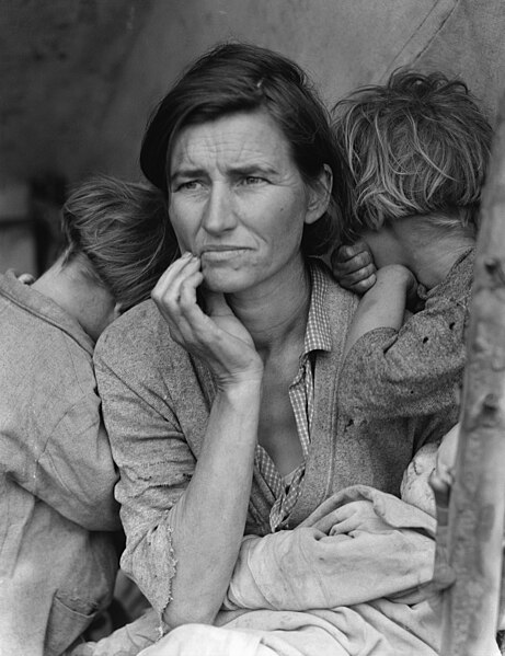
This photograph by Kata Kalman is a tightly cropped photograph of this workers face. He is young and has a determined expression that seems to challenge the viewer. He appears self confident but also I get a feeling of endurance in what I assume was a harsh environment. Factory workers in both Europe and US were presumably adversely affected by the economic recession of those years.
The photograph resembles the atmosphere of the famous photograph by Dorothea Lange, Migrant Mother, Nippomo, California.
In this photograph by Kati Horna, the features of a womans face are superimposed on a wall overlooking steps that presumably lead up to the cathedral. There is a window in the position of one of her eyes, and her eye is seen looking out over the steps. To me the woman's face is reminiscent of a Madonna expressing pity for the people's sufferings. I read subsequently, that Kati Horna was a woman photographer, close to Frank Capa who went with him to Spain during the Spanish Civil War. Her photography focussed primarily on the suffering of the ordinary people rather than the events on the front lines and battles. This photograph/photomontage seems to symbolize the desperation of the people in the streets during the civil war.
The impact of the image was not immediate, until I realized that the eye visible through the window formed part of a face. On reflection, the image is quite haunting, even though the facial features are more symbolic than portraying a specific individual.
There were two different portraits of Picasso in the exhibition, this full length portrait by Brassai, and a head and torso by Rogi Andre (real name: Rotzi Klein).
In Brassai's photo, Picasso is seated besides a huge stove or boiler that stretches up to the ceiling. The boiler is a very striking piece of industrial equipment. Furthermore, it has been lit to cast an oversize dark shadow on the wall, and Picasso is seated directly in front of the shadow. This gives the impression of a visual connection between Picasso and the boiler. Picasso is actually looking out of the picture away from the camera, as if he would rather be somewhere else. The lighting of the scene creates a strong visual composition, similar in character to some of Brassai's night photography. The exhibition notes suggested that the boiler symbolizes Picasso's creative fire. For me however, the lack of materials dropped on the floor, and the tweed suit and tie worn by Picasso do not strongly portray the vibrancy and chaos of testing ideas. Picasso looks as if he is about to leave for the opening of an exhibition of his work rather than work on his latest project.
Conclusions
These photos illustrate the variety of feelings conveyed by portraits: social reportage (Factory worker), symbolic/iconic representation (Stairway to the cathedral), visual pleasure of composition (In Picasso's studio).

Sunday, 25 September 2011

Robert Mablethorpe - Exhibition at Fotografiska Museum, Stockholm

I spent a morning at this exhibition at the beginning of September whilst on a trip to Sweden to visit an old university friend. The exhibition comprises over 200 prints on loan from Robert Mablethorpe Foundation in New York, including self portraits, portraits, nudes, flower photographs.
The OCA tutor for TAOP course had suggested I look at Robert Mablethorpes flower photography, as I had chosen black and white photos of Flowers and Plants for the Elements of Design assignment. I also hoped to see some portrait photography, although I was not familiar with this aspect of his work. I was pleased to find that there was a good selection of self portraits and portraits in the exhibition, several of which were of interest. I paid less attention to the nudes and figure photos which were the largest group in the exhibition.
General notes
Apart from some early Polaroid photos, the self portraits and portraits of celebrities seemed to be studio photographs using artificial light. Several of the flower photographs, on the other hand, gave the appearance of using natural light, with diagonal light and shadows lit as if in a room with skylights. According to the exhibition notes, Mablethorpe used a Hasselbad 500 for most of his work.
Seeing the range of his work together, I was struck by two characteristics:-
- He was influenced by classical art and sculpture in many of his nude studies of men and women, striving to photograph perfection in form (see comments on portrait of Isabella Rosellini below). He was described as a perfectionist in various parts of the exhibition. I felt that some of these were photographs of people as figures with an interesting shape, rather than portraits of people.
- In the self portraits, he often is dressed up and acting a part - as a hoodlum, as a woman etc. Even in his portraits of celebrities, he seemed to look for a dramatic pose, for example Donald Sutherland seems to be acting the part of a gangster or cop.
Self portrait 1988
Unusually amongst the photos in the exhibition, this is a relatively conventional portrait. The photographer is seated in an arm chair directly facing the camera. He is looking directly at the lens, leaning forward slightly with one hand on his knee and the other just below his face. He is simply dressed wearing a dressing gown and slippers. I understand that he died of aids in the following year, 1989. This photograph could have been taken when he was already unwell. The background would appear to be a backcloth which is curved underneath the chair giving a progression from mid- to dark-tone behind the chair. The lighting is mainly from the front so that there are virtually no shadows around the eyes and nose. There are also highlights in the hair suggesting that a lamp may have been placed above the head to make the hair stand out against the background.
Isabella Rosellini
This is a very striking photograph of the head and shoulders of this woman. Her dress, the background and her hair (apart from a highlight) are totally black. Her face and hands are lit so that they are virtually white with only the slightest suggestion of form (I assume that the light skin colour is due to lighting rather than make-up). She is glancing downwards with hands on either side of her face portraying a feeling of sadness or reflection. The reason for the unexpected familiarity of this image did not strike me until I saw the comment noting the resemblance to a catholic madonna.
This is a head and shoulders of the actor, standing sideways and turning to look at the camera. There are hard shadows under the hat, and eyebrow, and across the jacket, creating the impression that the actor is under a film spotlight. The actors expression with a quizzical raised eyebrow implies that he was caught in mid-performance. The plain background however suggests that the photo was taken in a studio photo rather than a film set.
Unusually photographed in profile, the mid- to light-tones of her face and hair stand out against the dark tones of the leather jacket and a light background. The result is visually striking and it would be interesting to know how he came to this composition. Also, having seen the self portraits in which Mablethorpe is role-playing, I wondered whether the jacket and expression are Annie Leibovitz's natural self or whether there is an element of theatre in the photograph.
This caught my eye not just because the subject is another famous photographer. I appreciated the variety in treatment with the Annie Leibovitz portrait. With Cindy Sherman, her clothes, expression and posture (with hands behind her back) imply a more introverted personality. Visually, the tone of her suit, face and hair are very similar, set off against a medium dark background. The framing is head and torso, which reveals the slightly sinuous posture, with the head leaning to one side, glancing at the camera. As with the previous photograph, it is difficult to judge how much the image is affected by an element of theatre and how much is natural to the subject.
Conclusions
The prominence of self-portraits in his early work made me realize that I should use myself as a subject and guinea pig to experiment with set arrangements and poses for the various projects on this course.
It also prompted me to strive for simplicity in composition and to use tones and colours in a selective way.

Saturday, 26 February 2011

Dmitri Kasterine and Mary McCartney - on display at National Portrait Gallery

There were displays of work by these two photographers, maybe 20 photographs each. As you would expect at NPG, these were all portrait photographs. It was interesting to study the contrasting styles of these photographers.
Dmitri Kasterine
Kasterine was active as a photographer in UK and USA for magazines, and is known for a close association with Stanley Kubrick. The portraits in NPG were mainly of famous cultural figures, painters, writers, actors. The portraits were black and white, they seem to have been taken in nature light with a plain wall or dark plants as background. The figures are sitting or standing still with quite solemn expressions looking directly at the camera. The sitters hands seemed to be particularly prominent (even where the hands are not visible e.g. Martin and Kingsley Amis are both standing with their hands in their pockets). The hands are clasped, or the arms folded, resting on the knees. His portrait of Samuel Beckett epitomises these characteristics.
Mary McCartney
The NPG collection of her photographs are mainly famous figures from the world of dance, fashion and other celebrities. The portraits are in colour, and there is a mix of interior and exterior scenes. The backgrounds of some are quite busy with bookshelves, office furniture etc. The characteristic that I particularly noted with her pictures is that the figures are almost all active. She seems to follow the style of Henri Cartier-Bresson of trying to take a photograph of the person at an expressive moment in a conversation. This style can be seen in her portrait of Billie Jean King.

Thursday, 24 February 2011

Photographic portrait prize - exhibition at National Portrait Gallery

On the same day, I visited the Taylor Wessing Photographic Portrait Prize exhibition. I had seen the exhibition for an earlier year before I started TAOP but was disappointed with the photographs at that time. In this years exhibition, I found quite a few of the photographs interesting. I am not sure whether the quality of the photographs was better this time, or whether my taste has matured?
The NPG website only shows a handful of the prizewinning photos. It therefore takes some time to track down copies on the web of photographs that interested me.
Lara by Vivi Ableson
I thought that this photograph was quite effective as the teenage girl is facing the camera, with the backs of two much bigger men on either side. The girl is looking straight at the camera in a very natural way, and is showing some interest in her surroundings, whereas the two mens posture implies that they have been sitting for ages and are totally bored. I quite liked the other photographs in the same sequence "Infantes".
Charlie Watts by Michael Donald
The lighting interested me in this photograph. The figure has a "painterly" impact against the dark background. I felt that the artist must have used photographic lighting to achieve this effect, even though the viewer has the impression that the light is coming from a window on the left. The level of illumination on the shaded side of the face, and the darkness of the background do not quite seem natural.
In this photograph, I liked the blue-green colour and graduated lighting of the background which complements the red-brown jacket of the subject. I feel that this background strongly enlivens the visual qualities of the photograph.
Golfing sisters by Anita Corbin
This photograph seemed to capture the style and character of these two striking ladies beautifully, in an unusual composition.
General points I noted from the exhibition was that almost all the photographs were colour, but often muted colours and pastels. I also noted that there were a significant number of portaits of two people together, such as Lena and Katya by Michal Chelbin (maybe undermining the principle that odd numbers are more photogenic.)

Wildlife Photographer of the Year 2010

In January, I spent a day in London visiting various photography exhibitions. This was the second year that I have been to the Wildlife Photographer of the Year exhibition. I found some very impressive photographs last year and I was not disappointed in the photos in this year's exhibition. The photographs that I particularly liked this year were the following.
Dawn Call by Pierre Verney
A stag stands bellowing in silhouette quite small in the frame against a blue-grey background. There is however a beam of yellow sunshine shining diagonally across the frame so that the stag is standing close to the apex of the angle where the sunlight reaches the earth. The "framing" of the stag is further enhanced by a line of yellow coloured plants in the foreground.
Rock Art by Verena Popp-Hackner
This is a colourful abstract with strong diagonals. Ridges of rocks on a beach are viewed at an angle and the shapes and colours zig-zag from top right down to bottom left. The colours look real and unreal at the same time.
The Big Four by Tony Wu
A photograph of a group of four sperm whales, two facing towards the lens and two sideways on. It seems that they gather together near Dominica to socialize and play. I particularly liked the way the muted sunlight revealed the form of the rather attenuated shapes of their bodies. (I had just finished the "lighting" section of the course).
Back in, front out by Era Malkonen
A delightful photograph of penguins, five with their backs to the lens, and behind them, ten or more facing the lens. Against the white background, the one facing the lens are only visible by their black caps, black eyes and beaks, and a thin outline of black around the shoulders and wings.
A marvel of ants by Bence Mate
The overall winner of the competition, the subject, composition, lighting of this photograph are outstanding. I stood in front of this picture for at least 15 minutes marveling at the shapes and sizes of the ants, the extraordinary length of their legs, the huge pieces of leaf they are carrying and so on. Visually, the mix of silhouettes and back lit and figures around the hole in the leaf is a beautiful touch.

Sunday, 12 December 2010

The Wayward Line - Exhibition of photography by Edgar Martins

The third photography exhibition that I saw in Paris was at the Centre Culturel Calouste Gulbenkian. Many of the exhibitions are only open in the afternoons, and this was one of the few open all day.
Edgar Martins is a young photographer who was born in Portugal, but has been based for many years in UK. The images in the exhibition were recent, selected from seven series including "A Metaphysical Survey of British Dwellings", "Reluctant Monoliths", "This is not a house", "Dwarf exoplanets and other sophisms". The notes to the exhibition state that "Martin uses photography to develop a philosophical, quasi-scientific investigation, examining various minimalist concepts of the contemporary urban landscape".
I came to these pictures from the standpoint of photography, rather than contemporary art or philosophy.
"When the light catches the shadow" series
My initial impression of the first group of pictures of the apron of an airport was that they were not photographs. The pictures were printed on large aluminium sheets with one side at least 1 metre or more. The surface of the pictures was totally matte with dense colours as if painted smoothly in acrylic paint.
These pictures were at nightime. However, there was not the slightest glimmer of light in the sky and virtually no horizon. This would be difficult to achieve by photography as there is usually some glimmer of light in the sky and total blackness would only exist in most unusual circumstances.
The main visual element in the photographs were the markings on the runways and parking areas. However, in order to achieve high saturation colours of the runway markings, I would expect that the tarmac surface would also have been illuminated to some extent. However, in the pictures, these surfaces were very dark with just the slightest hint of texture and form.
In some of the photographs, a single "spotlit" vehicle, plane or building was included in the frame, but no people or sign of human occupation.
The pictures were visually interesting because of their size and intensity of colours. Also, however, the world presented in the pictures was a "superworld". It appears to be a manipulated version of the world that we inhabit. I assume that the photographer must have used floodlighting and extensive manipulation to isolate the graphical elements that he wished to include in the final image.
"A metaphysical survey of British dwellings" series
The second series of images in the gallery were similarly unreal:-
These were again night time photographs in which a single isolated building surrounded by a pavement was floodlit as if the photographer was using studio lighting techniques. The skies were totally black.
There were traffic lights, and pedestrian crossings and street lights but not signs of human occupation. Again the road markings were brilliantly illuminated by the tarmac surfaces were unnaturally dark.
I was puzzled by the fact that the walls of the buildings were constructed of grey breezeblocks, rather than brick or stone. Reading the exhibition notes, I found out that for this series, Martins had photographed a special site used by the emergency services to train for fires and other emergencies. The world portrayed was in fact not the real world in this sequence.
"Reluctant monoliths" series
This was another series of night-time pictures with highly saturated colours. One of the most visually attractive pictures was a brightly coloured warehouse. The building was long and low and the photograph was taken square on, so that only the front elevation was visible. The visual impression was reminiscent of an "architects drawing" for a client, with dramatic use of light and colour.
The roof and some walls of the building were totally black, but the doors and surrounding panels were a variety of saturated primary colours: red, yellow and blue.
The sky and ground were totally flat black with the exception of a little texture in the foreground.
I also enjoyed a photograph of a smooth ovoid structure (which I assume was a building) in a totally dark scene. In this case the structure was a neutral off-white colour rather than brightly coloured which was softly lit from above to emphasize the rounded shape of the structure.
Conclusions
In total contrast to Bressons photographs, Edgar Martins would appear to be an artist who is using photography for his work, rather than a photographer who aims to produce artistic photographs.
I enjoyed the unreality of the world presented in these series of photographs. There were also series of pictures of planet-like spheres which I did not find as interesting. Another series was closer to photo-reportage. He had photographed houses and land in USA that had been abandoned as a result of the credit crisis. These were daylight photographs which were visually less unique than the night-time pictures noted above.
I was interested to note that Martins work was featured in a cover article in British Journal of Photography in 2008.

Friday, 10 December 2010

Henri Cartier-Bresson at Fondation Henri Cartier Bresson, Paris

Whilst at the Harry Callahan exhibition, I also took the opportunity to look at some of the photographs by Henri Cartier-Bresson. There were handful displayed on the top floor of the FHCB building and I also watched a 45 minute video of Henri Cartier-Bresson talking about his photography and his photographs. I also noted a number of his observations on photography from one of his books on display. Interestingly, he seemed to approach photography in a totally different way to Harry Callahan.
  • Rather than concentrate on a few types of photograph, Bresson seemed to have produced photos of so many different subjects and types:-
- Portraits of famous people
- Candid street photography
- War and press photography
- Fine art photography and photography books
  • People are frequently the visual point of interest in his photographs. He finds human interest in ways that intrigue the viewer - a fat man in a bowler hat walking through a playground of children - a puddle of perfectly still water about to be disturbed by the foot of a pedestrian - a group of children playing in what appears to be a damaged building, one of whom is on crutches implying some awful previous event. His photographs of street scenes convey the scene in terms of the buildings and passageways in between, but typically this is enlivened by a running child or figure in a patch of sunlight.
  • In the film, a woman whose portrait he had taken described how he held her in conversation. He waited until she was making a point when he suddenly took the photo which became the portrait. It was noticeable in the film that the portraits were taken when the subject was actively talking or gesticulating. Also the individuals were in their normal surroundings, not in a studio or set. This is totally unlike the Irving Penn portraits where most were in studio surroundings. For Bresson it seemed that the photographers purpose was to catch the subject's vitality and manner. For Penn it seemed that the photographer wanted to emphasize the persons physical peculiarities in a more static pose.
He is portrayed in the Thames and Hudson book "Henri Cartier - Bresson" as being a man of few words, but I found his comments in the film on the "decisive moment" and other matters as memorable. He seems to be the ultimate "practitioner" of photography, whereas Harry Callahan was both practitioner and theoretician.
I noted a few of Bresson's views paraphrased from the introduction to his book "The choice of Henri Cartier-Bresson":-
  • Taking a photo - all the faculties converge in the face of fleeting reality.
  • The place and rank of photography as an art form is of no concern. This is purely academic.
  • He is amused by the insatiable craving for sharpness of images.

Harry Callahan, Variations Exhibition at Fondation Henri Cartier Bresson, Paris

I took the opportunity of a couple of days in Paris to visit some of the exhibitions of photography taking place there. The first was this exhibition of Harry Callahan's photography called Variations. Harry Callahan (1912 to 1999) was a self taught photographer who before taking up photography in 1938 was an accountant in the motor industry in Chicago. He viewed his photographs as an art form influenced by personal friendships with Ansel Adams, Edward Steichen and Laszlo Moholy-Nagy. He became Professor at the Chicago Institute of Design. Harry specialized in black and white cityscapes, nature, and photographs of his wife Eleanor. The exhibition was a retrospective of his photographs in all categories. His work does not appear to be as well known than these american contemporaries despite recognition from John Szarkowski and Henri Cartier-Breson but I found the photographs interesting as he was succesful despite being a rather quiet and self-effacing character. The prints were quite small most of them being 10 to 20 cms along the longer side.
My observations were as follows.
  • The photographs appeared to use natural light, and there was no indication of studio lit subjects (unlike for example the still life photos by Edward Weston).
  • Many of the photographs used high contrast to create visual impact. For example, there were a number of abstracts with a few dark parallel lines on a white background, where I believe overhead wires were the subject. I also liked a study of a plant and a photograph of bare trees dark against a white and pale grey background.
  • He used black and white to emphasise the visual shapes of nature. For example, there were a couple of photographs of grasses where the shapes of the grass leaves were just visible against a very dark background.
  • My first impression of the series of nude photographs of his wife was somewhat disappointed as the high contrast and flat lighting emphasised the outlines rather than the contours of the human form. However, a review of two of these photographs by Martine Ravache, a Parisian photo critic and historian, in "Connaissance Des Arts - Photo 25" took the position that these were landmark photographs. Martine argues that the the photographs should not be viewed simply as a portrait, but as an allegory of a real women, neither beautiful nor ugly, but idealized by the high key treatment.
  • Apart from the posed photographs of his wife and daughter, he took few portraits. He took quite a variety of candid street photographs of passers by but he was not comfortable taking interacting directly with people to take their portrait.
His character and photography contrasted significantly with that of Henri Cartier-Bresson (see next blog).

Thursday, 16 September 2010

Edinburgh Photographic Society - International Exhibition of Photography 2010

The last of the three exhibitions that I visited in Edinburgh last month was the 148th International Exhibition of Photography organized by Edinburgh Photographic Society. The exhibition showed about 200 photographs from forty countries. The nature and range of the images was typical of club photography these days.
I made notes of several of the entries where the composition seemed interesting.
Winters day - Robert Fulton
This is a stunning winter landscape in which the dark waters of a river in the foreground contrast with a snowy scene. The horizontal perspective lines of the river are bounded by triangular snowy banks, with a single tree in the left middle distance. There is an implied triangle of snow covered water reeds set in the dark waters of the river. The sky has horizontal bands of blue-grey cloud which are reflected in the mid-distance water. The visual impact is stunning. Whilst the scene looks unreal and rather "photographic", it was one of my favorites in the exhibition.
Days of despair - John Powell
A total contrast to the previous picture, this photograph appears to show a tense situation in someones private life, in a gritty realistic way. The scene is an interior decorated in a post-war style. In the right foreground is an older woman wearing a floral pinafore staring fixedly to the right of the lens as if she is angry about something. We see her from the waist up, as if we were standing right by her side. In the soft focus background is a man with his hands in his pockets with a rather resigned air. It is not clear whether this is a real scene or a staged scene. The narrative is as clear however as if we were seeing actors on a stage or in a film. Indeed the use of black and white is rather reminiscent of a 60's art-house film.
We can make it - John Powell
Another photograph of gritty realism by the same photographer. This time the subject is a military-style assault course. Again there is a figure in the right foreground clambering out of a water filled trench who has muddy rivulets running over his head and face. In the soft focus background we can see the tops of the heads of four others struggling through the trench under a low barbed wire barrier. Again the use of black and white is rather reminiscent of an old war film. The layout of the frame is remarkably similar to the previous photograph but it is the expression of determination and effort on the face of the man in the foreground which makes the picture in my view.
Serving Tsampa by Petr Vydra
A black and white photograph of a boy serving liquid out of a bucket to three older men in a third world country. On the right hand side, we see the profile of a man sitting on the floor holding his mug to receive a ladleful. The back of his head and shoulders are lit from a doorway on the right hand side and a little reflected light is catching the features of his face. The boy is standing, bent over the bucket near the center of the frame. His face and side are catching the light from the door. In the background on the left hand side two men are sitting already drinking the liquid. The room is totally bare, and this could be a room in a buddhist monastery or simply a village scene.
Unlike John Powells photographs above, the men's faces express no emotion. If anything they have a stoical quality. The viewers eye is drawn through the picture in an s-shape following the faces and bodies of the men from front right across and back into the frame. The lighting of the figures create a succession of vertical dark and light bands across the frame, so that there is strong contrast between each of the individual figures.
Silver Fields by Irene Froy
Unfortunately, I could find no copy of this specific photograph that I could link to. Irene Froy's gallery on her website has similar photographs of fields and beaches with etherial lighting. This one is a black and white picture of a landscape taken from a high viewpoint. We are looking down from a distance over an undulating field of grass or crops which is back lit. The sunlight is catching the tops of the crops. There is a solitary tree and its shadow just left of centre as a resting spot for the eye. In contrast to the Winter's Day photograph above, there seems to be greater realism in this photograph. It is possible to imagine finding a place that looks like this. This was the only photograph that I picked out which had been selected as Highly Commended by the EPS judges.
Conclusion
The standard of photography in the exhibition was generally excellent. There were many more photographs that I thought were worthy of note.
However, I was less impressed by some of the prize-winning photographs. In particular a photograph of the corner of a side-table with cup on it against a plain wall seemed uninteresting visually and emotionally.

Sunday, 12 September 2010

World Press Photo 10 - exhibition at Scottish Assembly, Edinburgh

I visited this exhibition whilst in Edinburgh last month. In total contrast to the visual pleasures of the Edward Weston photographs, many of these photographs show dreadful scenes. As expressed by the judges of the competition "all jury members shared a stark feeling of how little of the worlds sorrow we were actually able to absorb, faced with 101,960 competing images. It was if the intensity of the drama had a paralyzing visual effect, because it was so often repeated."
I chose to avoid the most shocking photographs and selected a few of the photographs which drew my attention for their composition. (Note that I have created names for these photos myself for the purposes of this blog as no titles are given in the exhibition.)
Glaciologists, Greenland by Nick Cobbing UK
This is a photograph using colour accent in a very effective manner. In this photograph, a melt water "river" starts at the bottom right of the frame and winds away into the opposite top corner across a snow covered glacier. The water is very translucent so that details of the glacier underwater are clearly visible. The water is medium blue, and some distance away are two very small bright red canoes. These contain the glaciologists measuring the melt rates of the glacier. This photograph was presumably taken from an aircraft on wide angle. The intense red of the kayaks contrasts very strongly with the lighter blue water drawing the viewers eye to these tiny figures in the landscape.
Starlings over Rome by Paolo Patrizi
The subject is similar to "Starling Wave" by Danny Green that was a prize winner in the Nature Photographer of the Year 2009 exhibition. Also in black and white, the visual effect in this case is even more abstract. No ground is visible to anchor the scene. There is just a complex of spirals and fractal forms emanating from a central area rather like a negative of the Milky Way.
Bedding left out to dry by the homeless by Pierre-Olivier Deschamps
The photograph shows some pillars in the pavement of the Champs Elysees in Paris, three of which have been draped with sleeping bags or blankets of someone living on the streets. I believe that the picture stands out visually because of the repetition of the shapes of the three pillars and as a result of the treatment of colour:
- Each piece of bedding has been draped into a similar shape, but at first it seems impossible to understand what are these objects and why are they so neatly arranged.
- The blanket on the middle pillar is a mid-orange colour, but virtually everything else in the frame is in shades of grey.
There are clues to what is happening in the doorway in the background. There is some cardboard and a plastic bag, but no-one is visible. This is a picture where the viewer is presented with a mystery to unravel, and where the clues are shown in the frame if one looks hard enough.
Body of alleged drug dealer by Guillermo Arias
I think that this photograph attracted my attention from a distance because of the chiaroscuro lighting. Looking more closely, it gradually becomes clear that the white sheet over the central chair is covering a body. More grimly, there is a splatter of blood on the wall behind.
Many of the press photographs of violent events in the exhibition grabbed attention because of the shock of seeing such explicit scenes, more than their visual qualities. This, on the contrary, is one where the visual qualities of the photograph lead the viewer to look more closely and subsequently grasp the nature of the violent event being portrayed.
It also interested me that empty chairs are a relatively common subject in photography exhibitions and competitions. Sometimes it is only their physical structure that is significant as in the following photograph that I took a few years ago:-
In other examples, the purpose seems more symbolic for example the interior photographs by Susan Geen FRPS that were included in an exhibition of photographs by Atrium Photography in Guildford a few months ago. Her photographs are interior settings of chairs and screens draped stylishly with discarded clothes left by absent occupants. The photographs are printed quite small so that it is necessary to stand close to see them properly. Together the effect is rather voyeuristic as if seeing something intimate about the people who are not present.
Conclusions
Press photography shows us some realities of the world that I normally would not wish to see or to accept. (To be fair, there are several photographs that show realities that are extraordinary and marvelous.) Few of the subjects would be considered attractive visually, but it seems to me that the photographic skills learned on this course used primarily to present the world in an attractive light are equally effective in recording such terrible events and situations. A still photograph can be as powerful as video as it allows a more profound emotional effect as there is some silence and stillness.

Saturday, 28 August 2010

Edward Weston Life Work: Exhibition at Edinburgh City Art Gallery

I visited this exhibition earlier in August during a holiday with friends at the Edinburgh Fringe.
Before visiting the exhibition I was aware that Edward Weston was one of most prominent photographers of the 20th century, but I had only a vague idea of his work.
As noted in the exhibition leaflet, this is "the largest exhibition of his work ever to visit the UK, and it presents a survey of his career".
The exhibition included photographs from various periods including portraits, still life photos, landscapes and nudes. Many of his most famous images were included. I also purchased a small book on Edward Weston published by Taschen which includes many of these photographs. There is a large collection of his photographs available on line at the Centre for Creative Photography at the University of Arizona.
My immediate impression on glancing around the exhibition rooms was the strong composition of many of the images, even though the prints were relatively small by modern standards. In my notes I recorded brief details of several of his less well known photographs where the composition caught my eye.
Sunny corner in an attic:
A man smoking a pipe is resting against a shady area in the bottom right hand side of the frame facing to the right out of the frame. Light streaming from the left hand side of the frame is lighting up an adjoining wall and it is just catching the side of his face. In my sketch of the composition, I thought that the wall against which the figure was leaning was a rectangular block as if on a roof top. Having seen some other images, I guess that the scene is instead the interior of an attic where light is entering from a dormer window or skylight.
The polygonal shapes of the light and shade in the attic are not readily resolved by the eye into a three dimensional structure. The presence of the figure in this abstract scene seems unreal and ungrounded. This seems to be a situation where interest is created by the absence of understandable perspective and a departure from conventional composition.
Grinding maize:
In the centre, a Mexican woman is sitting with her back to us on a light coloured mat. The woman has a dark skirt which is spread out around her on the mat. She is wearing a light coloured blouse which stands out against the dark shadow area surrounding the mat. We cannot see the woman's hands but she is hunched forward so that her head is barely visible. We see just a plait of hair laying between her shoulders.
This is a strong image due to the contrasts between the woman's clothes and the background with dark on light and light against dark. The woman's posture conveys the effort of grinding, without showing her hands working. This is not a dull subject and the relatively symmetrical horizontal composition works well.
Toadstool:
This is a picture of the gills of a toadstool. The toadstool is on its side with the underside facing the lens. The stem is a dark shape in the lower left foreground. The light toned gills on the underside of the toadstool radiate from the top of the stem. The head of the toadstool fills almost all of the frame except for the corners, which are dark.
Similar to some of his other still life photographs of vegetables, the picture celebrates the structure and texture of the toadstool. The light appears to come from below and spreads across the underside of the gills which seem slightly translucent. In one of the later exercises of the course, I will need to attempt something similar to demonstrate the structure and texture of a subject.
Dunes at Oceana:
He took many photographs of dunes at Oceana. The one that I examined at the exhibition was taken from a high viewpoint looking along an undulating ridge of sand. The ridge starts midway up the left hand side of the frame and descends to the bottom right where it curves upwards and snakes away into the distance exiting the frame in the top right hand corner. The light is fairly high in the sky so that the only shadows are to the front and right hand edge of the ridge of sand. Little texture is shown on the flat area of sand behind the ridge.
I find it difficult to analyze why this composition is so effective. It may be the subject's shape has the characteristics of fractal geometry and this is what attracts the viewers eye. It recalls one of the paintings by Jean Miro that I saw at the museum of his work in Barcelona. A single line undulates across a neutral background on a huge canvas that filled a wall of the exhibition room. Despite its simplicity, the composition of this painting appeared to be interesting and balanced.
(This particular painting is not shown on the museum's website unfortunately.)
I also found it interesting that the size of the photographs was quite small. The photograph of Dunes at Oceana was about 25 cms by 20 cms. One of the famous nude photographs was only about 10x7 cms. This is significantly less than contemporary photographs e.g. the exhibition of Irving Penn photographs at the National Portrait Gallery.
I read the commentary in the book but these dealt mainly with Edward Weston's significance in the history of photography. I am more interested in his compositional repertoire and techniques.